Strange Bird Immersive has officially reopened! It was an all-consuming journey, one I’ll recount in future posts, but more fascinating than the nuances of construction we had to master I think is how The Man From Beyond has changed.
What follows is a chronicle of some of those architectural changes and how audience responses have changed, so brace yourself for level-one spoilers (with photos and everything!) of what’s inside Madame Daphne’s. No puzzle solutions or plot points are spoiled, but you’ll see furniture and hear about function. And I’ll warn you clearly when there’s something level-three. So if you’re the type who travels for immersive experiences and wants to know absolutely nothing, go ahead and skip to the next post.
When we decided to move to an expansion location in Houston, we knew we didn’t want our award-winning show to change—at all. Escape rooms are delicate soufflés. Something as minor as a font change can take a clue from seen to unseen. We wanted to limit the changes as much as possible to avoid throwing off that balance we had worked so hard to achieve in our original location.
But changes are inevitable. In proscenium theatre, you can plan a show to fit on every major stage in the world, no problem. It’s cookie-cutter theatre. In site-specific theatre, there are some features of the space that you can’t change or can’t afford to change and you have to find a way to make it work in your favor. And then you have to do it all over again when you move.
Is strange bird really site-specific?
Many immersive theatre experiences find a location first and then create around that. Many escape rooms do this, too (which we kinda sorta totally recommend doing, because custom walls are expensive). This location-first, creation-second approach makes for a deep union of architecture with experience and earns the name “site-specific theatre.”
By the time we were real estate shopping for The Man From Beyond in the fall of 2015, we had written the show. We knew what furniture we needed and even had a layout. When we found just the right space, we still had to add two custom walls. So in the common use of the term, we really weren’t that site-specific. Of course there were many details we still had to figure out by the time we moved in, and we did what we could to embrace the space, rather than fight it.
When we submitted our floor plan to the architect of our new space, we planned for the parlor to be identical in size. Flipping the orientation of just one piece of furniture, or the location of the parlor door, hell, even the direction of the door’s swing, would throw something out of balance. The second time round, we built even more custom walls (to say nothing of our next show, Lucidity), so in a way, we became even less site-specific. Still, we had to adapt to the new space, and how people are responding to those changes, when all else is the same, is fascinating.
Ceilings
The original Silos location had low ceilings covered in pipes. PIPES EVERYWHERE.

Seriously, who would put a Victorian séance parlor in this industrial space?
We fought the pipes. We painted them black. Can confirm the color black does an amazing job of making things disappear. We also hung bolts of landscaping fabric to cover the hideous chicken-wire ceiling that frankly had a certain smell to it.

On the plus side, the pipes were great for hanging theatrical lights. They also did a phenomenal job of masking our deep magic, the magic we don’t want you to discover. With such a ceiling, who’s to know that junction box is a fake?
The ceilings in the parlor sloped, from about 8 feet to 10 feet. We used this to our advantage by putting our show-stopper piece, the historic mantel, at the high end. It had a certain psychological effect. But it did mean that another very impressive piece of furniture, “The Cabinet of Mysteries,” was crowded on the low-ceiling end and had a pipe that blocked the sign on top. Honestly, we’re lucky it fit at all.

In our new location? The ceilings we inherited are 12-feet high with black acoustic tile. It’s like night and day. The results? “The Cabinet of Mysteries” looks GREAT…

…but we’ve had to re-design all of our ceiling magic, and that includes a whole new mechanical device as well as software recalibration. Many elements are all in “beta test” again, against our will. Good news is they’re working well so far, but I don’t trust anything until it’s fired correctly 100 times.
On the plus side, the ceilings are high and clean, and while our previous guests may not have thought it was a show about pipes, our new guests have to suffer none of that subconscious crowding.
When Madame Daphne opens that door, they gasp. They never gasped before. It’s the same hand-stenciled wallpaper, the same furniture, the same lighting and music, but that gasp is all-new.
It’s the ceilings. I’m certain of it.
For love of a pipe
The old space had this gigantic elbow of a pipe coming out of the wall.

It was about 5-feet high, jutted out, and didn’t even have the decency to be in a corner. Prime placement for “I hit my head in your escape room!” To mask it, while also drawing attention to it, we draped a red silk dupioni curtain over it.

No one ever hit their head—success!! The curtain also made for a lovely cinematic nook for our projector videos, encouraging people to gather around the projector as a team, rather than view it from across the room. It also softened the harsh white rectangle of the projector screen itself.
We loved our solution to that damn pipe so much we rebuilt the pipe. No joke. Same height and everything. We didn’t even debate it.

A matter of inches
Due to an architectural curiosity in the new parlor, the desk is about three inches closer to the corner than it used to be. No big deal, right? Wrong. Turns out every team isn’t noticing a detail about the desk until clued about it. It went from 90% notice to about 10% notice. Which, luckily in this instance, is actually better! We wanted them to need the clue. But seriously. Three inches! What was I saying about escape rooms and soufflés?
Rules Hall
The layout of our rooms in our original location left this little hallway, 5 ft by 10 ft connecting two spaces. While I initially imagined we’d just walk through this space, when the reality of decorating these spaces descended, I realized we could use a separate transitional space, for one little scene only: the reading of the rules.
Thus, Rules Hall was born. While all immersive entertainment needs a reading of the rules at some point, I doubt we’ll always create a separate space just for rules. But Rules Hall makes for excellent theatre: the darkness focusing player attention, the medium’s sinister teasing ramping up their anticipation, the cramped quarters making the parlor reveal more breath-taking.
Needless to say, Rules Hall is back, and just as small as ever.
Level-THREE-spoiler thing
But we couldn’t rebuild everything.
In our earliest blocking rehearsals, it occurred to me that we could use the stairs outside the studio as one of our sets. It was my favorite site-specific choice that we made.
We’ve done what we can. In our new location, Strange Bird has ownership of the world outside of Daphne’s, so this scene has become psychologically safer for players, which is both good and bad. We re-created the same stark aesthetic: bright lights, white walls, the need to whisper. But we could hardly rebuild the stairs themselves. A bench suffices, and while the cinematic picture of this moment has improved, it’s not inspiring quite the same flavor as the stairs. I miss them.
END OF LEVEL-THREE SPOILER.
Tarot Reading room
The most obvious change to veterans of the séance is in Madame Daphne’s Tarot Reading Room. Due to architectural restraints (we tried to preserve as many extant walls as possible), the room ended up longer and a foot less-wide than the previous space. This done screwed up the furniture.
Now instead of being tucked to the right of the entry door…

Daphne’s table is as far from the door as possible, past all the other furniture.

In the old space’s corner, she would often startle people, which was a sort of fun, but not elegant. Now, the visual is better: BAM! There she is when you open the door. Being further in challenges guests to venture deeper into the room, and if a line forms to greet her, everyone is immersed in this new space rather than waiting outside. But so far they seem far less inclined to sit on the couches. Perhaps there’s more room, or they don’t see the couches they passed by in the new configuration? Both of our Daphnes are reporting that they have to invite them to sit.
There are also a couple of moments with the mirror behind Daphne’s table; now that it’s not by the door, one of them is a bit awkward (but has to be powered through), and another moment we’re often cutting on the fly, because no one is there to see it. Little changes like this can have a big impact.

I’ve already had one veteran praise us for moving Daphne’s table, as if it were calculated. Truth is, it was the only layout in that room that worked! Not all design is deliberate, although it always reads as such—which means you do always have to own it.
You’ll notice in the new layout that we have an inexplicable second door in the middle of a wall. This is for players to exit from—the distance to exit could not exceed 75 feet, and with the door we wanted players to enter from, the path would have been over that mark. For experiential reasons, we wanted them to enter through a different door. For reasons of safety, we needed a second door. Thus, the Star Door was born.

Again, not a thing we chose to do deliberately, but we do have to own it. The treatment of this door is totally a thing Daphne would do, and the reverse side is totally a thing Adrian Rook would do. World-building wins all-round.
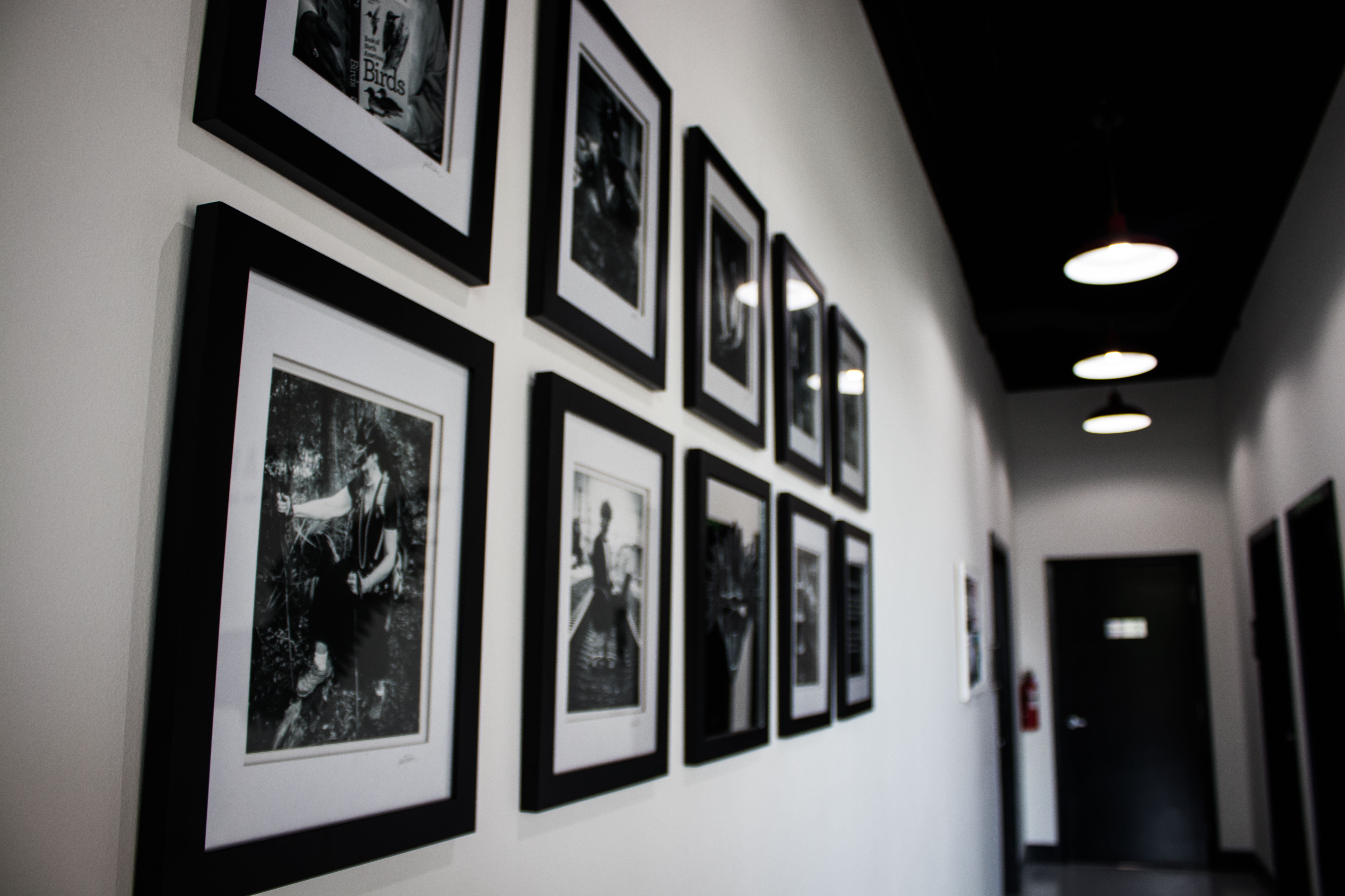
Overworld
By far the most drastic change in our relocation is the addition of a meta-lobby space. Originally we conceived of renting out individual studios for each Strange Bird experience. This is why the Tarot Reading Room functions just like a lobby—we needed a space for players to gather “in-world” before the experience officially began. Of course, we never mentioned the phrase “Escape Room” in this hallowed space.
When we opted for many reasons to expand to a single, larger location, we had to take on a lobby to connect our different experiences, just like all the other escape room companies.
But what does a Strange Bird lobby look like? What do Strange Bird restrooms look like? How do we want people to feel and act in this extra-lobby space? We knew we wanted to keep our commitment to immersion, so if this isn’t an escape room company’s lobby, whose is it?

I took to calling it the Overworld. Just like in Zelda, our Overworld connects each of our games into a cohesive world, the games in turn functioning like self-contained temples.
The Overworld has its own story to tell and its own emotional effect, an ideal prologue to every game we’ll ever create. And when the time comes and Madame Daphne opens her doors, she’s greeting guests who are more excited and even more eager for interaction than before. The ice has already been broken.
In order to make a clear delineation of who is in charge of which spaces—I am the set dresser of our rooms, at the end of the day—we went with strong bright lights and a black, white, and chrome aesthetic. It is very modern and very now.

And you notice when it changes. When you enter Madame Daphne’s, you know you’re in somebody else’s space. I also suspect we won’t get any more people wondering if they have suddenly time-traveled to the 1920s when they step into her parlor. Our experiences are designed to be as real as they come, and our Overworld reinforces that.
The Overworld is also architecturally weird. It’s just a little bit disorienting—always an immersive plus. And it is impressive. I recently overheard a player conversation, “ARE THOSE DOORS REAL?” “I THINK SO???”
Ultimately, more space means the experience is bigger. It feels like you’ve arrived someplace special. Now that’s a change I can live with.
Discover more from Immersology
Subscribe to get the latest posts sent to your email.


As someone who has moved a game from one location to another… to another (!), this write up speaks to my soul. Particularly the part about creating “the overworld” since that is another puzzle that needed to be solved as well (yours looks/sounds amazing). I can’t wait to return to Houston and see the new incarnation of The Man From Beyond! And the overworld!