Time to close out my series on Bookends and Bottlenecks with a gift.
In order to take control of your structure, it helps if you can see it. This is where a map comes in handy.
You can call this visualization a number of different things: map, diagram, experience flow, puzzle flow, flowchart. There are many different ways to make one and many different tools to get you there. But make one, and you’ll see your experience in a whole new light.
This post will walk you through how I create an experience flow from the player POV.
The Layout
As my physics teacher taught me, time is always along the x-axis, so that’s what I do here. This translates into a long landscape instead of a long portrait, but I think they are easier to read this way. I like to print these, so if I find myself running out of x-axis space, I snake the rest of the flow down below the first part or spill over onto a second page.
The y-axis represents paths through the experience (over time), with shapes along those paths for what are a variety of events.
The shapes represent…
Scenes: a passive beat with no “solve” action, so this can be narrative beats or out-of-world hosting by a Game Master.
Starting Point: this is a easily-discovered prop or set piece that delivers a clue. (If a starting point is a hard-to-find item, I’ll pair it with a solve action symbol).
Solve Action: represents the brain time (“aha!”) plus the physical action taken to unlock a new thing. I like to delineate these into “Plug-in Action” (perform this task or put this key into a keyhole somewhere) and “Decode Action” (anything that is harder than a simple task). Every action in an escape room is something a team can get hung up on, so it makes sense to map any action that may need a hint. Plug-in steps are green squares—”green for go!”—and decode steps are red squares for “this one’s gonna slow you down.”
Result: like a Starting Point, a Result is typically a prop, set piece, or other kind of information, but is gated behind an action. It can be the starting clue to a new action or a meta-level object that ends a path.
Here’s a look at the shape legend I use…

I also include room breaks (where applicable) and act breaks (which don’t require room transitions, but a room transition will most likely be an act break), noted via lines and labels. I break our shows down into: Act 1: inciting incident (usually scene-heavy); Act 2: escalation; Act 3: turning point; Act 4: climax; Act 5: fulfilling finale (usually scene-heavy).

I draw arrows, always going left to right, between shapes to represent the connective tissue of how a key (starting point) leads to unlocking a drawer (plug-in action), which leads to a paper clue (result/new starting point). Some arrows are short, where other arrows stretch all the way across to the end (say, if players can gain something early that they need at the end, but gaining the rest of the items take more complicated paths). To make it most legible, I keep my paths as in-line as possible.
Lastly, I include text labels on or beneath each of these shapes to identify what precisely it represents. Putting a label inside the shape itself works best, which some programs allow you to do. Important to keep labels succinct, but the map loses a lot of its communicative power without them.
It can prove impossible to be fully comprehensive. You don’t need to be. I know I don’t include a shape for every required action (solve cryptex, figure out how to operate cryptex, fish out tiny note inside, read tiny note, etc.). Remember this is for you and your team to best communicate the guest experience.
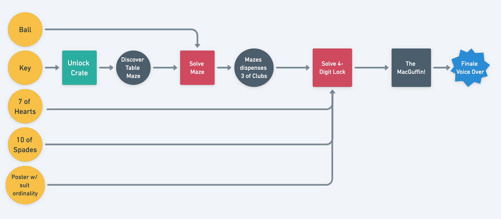
Simple Experience Flow
Here’s an example of what a (silly) two-puzzle escape room might diagram like:

At a glance, you can see a lot about this experience…
While there are multiple path lines, it’s ultimately a linear experience, as everything found feeds a single path. (A more proper open-path would have multiple steps per path line before funneling down.)
However, people won’t necessarily be standing around waiting for the Table Maze crew. There are other rewards in the environment happening. But once the two cards, ball, and the poster have been found, then teams might grow more impatient.
There are two major solve moments: table maze (assuming a challenging one) and the 4-digit lock. Finding the objects, reading the poster, and unlocking a crate should be quick actions. Hence my classification of this as a two-puzzle game.
Players will need to have found a fair amount to get past the 4-digit lock: poster, two cards, and the final card from the solved maze path. If any one of these items is missing when they hit this point in the experience, players can’t progress. Ideally, players have everything by the time they finish the table maze, but not always! The diagram helps GMs keep things straight (say, if the poster hasn’t be read yet, they’ll want to be on stand-by with the poster hint ready).
It has weak gating. The flowchart does a nice job of showing “There are things you can find immediately, but they don’t become useful until later.” You can find the ball but until you discover the table maze, you’re absolutely baffled by a ball. As a design choice, weak gating isn’t inherently bad, especially if players don’t puzzle over it for too long. It can be fun in that there’s an “Aha! So that’s what this is for!” moment, much like foreshadowing in literature. But it can also be a time sink. Like all things, watch and see what works.
This puzzle flow also reveals to me that there’s a potential for players to spin the final digit on the four digit lock before the table maze has been solved. I’d want to swap out what the maze dispenses with either two cards (and remove one card from the beginning), or potentially have the maze reveal the ordinality. Jumping the flow is bad, mmmkay?
Complex Experience Flow
Here’s what a whole game might look like in my style, unlabeled. Don’t worry, this is based on nothing, I promise. (Besides…can you have an experience spoiled by staring at an unlabeled map anyway?)

At a glance…Act 2 has two paths, Act 3 has three paths, Act 4 is all linear/bottleneck. The structure is relatively simple, so there won’t be a sense of chaos in this game. There’s one meta puzzle that requires four items/pieces of information and actually requires an item gained from Act 2 (so if that’s in the previous room, players may have to run back to get it). There are nine decode actions and three simple plug-in actions, which may be a little light for 60 minutes, but it depends on the puzzles, of course.
Here’s a more complex flow, that I made in 2015 after playing my first escape room that I ever loved. This game is now closed. No act breaks here, because it was all one messy, joyous experience. Imagine arrows in place of lines, please; apparently I started my mapping journey in Illustrator (?!?), which I’m an expert in and would recommend as a mapping program to no one.

At a glance…the game has two objectives with completely independent paths (so you could get the door open, but not yet have the MacGuffin, an unusual structure). Lots of gathering of similar items, like puzzle pieces or all the things you need to get a clue from a DVD. The main meta—the HBG combo lock—requires the completion of four different paths. Each path ends in a letter, which gives a sense of progress towards the end goal. Lots of “search” items (as befits a game from 2015), where the “starting point” symbol is paired with a “plug-in action,” since finding something cleverly hidden can’t be taken for granted.
With so many starting points and paths available, you can guess that this game would keep a large group occupied. 9 decode actions and 23 plug in actions. Wow. That’s a lot of quick hits!
Looking at this map makes me miss old-school games.
Which Program?
I started making Strange Bird’s maps in 2015 in Google Drawings. Like any illustrating program, Google Drawings is frustrating. It wasn’t built for flowcharts, but I got it to work for me. Google Drawings is available as a document type through Google Drive, so you’ll need access to that. I cannot in good conscience recommend it to anyone, but after all the suffering, the result is a very clean map. Main pro: it’s free and stays free.
There’s a wide array of programs to choose from these days. A critical feature you’ll want is arrows to snap to shapes, so that when you move the shape, the arrow follows it. It’ll also help a lot if you can label the shape itself, so that your labels also follow as you move shapes. Test before you dive deep into a program.
For this post, I’ve tried out some other programs…
Online subscription programs (Whimsical, Miro, etc.)
For shared accounts, you only get three free flowcharts before they flip you to the dreaded subscription model. But for a solo private account (and probably there’s only one person in charge of these charts anyway?), you have unlimited boards. You may encounter additional BS like low-res exports on the free tier. The ease of use is superior to Google Drawings.
Of all the programs I tried for this article, I liked Whimsical best for its sheer speed. I created its chart the fastest. It also doesn’t look hideous.


Draw.io
Available online or even offline. Unlimited, open source, not going anywhere. I liked this much better than Google Drawings, although it still presented a couple moments of sheer rage. Not as fast as Whimsical but earns bonus points for not being subscription BS.

Offline Programs
I’ve heard from folks in the community that Visio from Microsoft is their preference. Apple has a program on Macs called Freeform, but the arrows didn’t snap to shapes, so I noped out of there fast. Illustrator is also a hard pass. There are many more options I don’t know about. This rabbit hole is deep.
The Why
When I played my first dozen escape rooms, I mapped them by hand afterwards, trying to make sense of the chaos: why did this game feel frustrating? Why did this game feel fun? Answers were often in the structure: poor gating that gave us stuff well before we could use it or brilliant meta-puzzles that gave the whole team a sense of progress. It helped jump-start my education.
Once you start mapping your experience (imagined, designed, or already produced), you’ll see many benefits…
Maps help you identify your bottlenecks. Bottlenecks are a neutral tool, and a flowchart ensures that you have bottlenecks where you need them and not where you don’t.
You can see clearly which moments are open-path and which are linear. When only one path remains, expect escalating player frustration the longer it takes, so it’s a good time to be hint-ready.
You can clearly see your meta-puzzles (puzzles that require multiple parts to proceed).
It allows you to count your puzzles and gauge your difficulty. Remember each shape is a step needed to win.
Gating issues and other issues of complexity show up, such as: they have to carry this prop into the next room.
Once out of the design phase and your project has been built, the map is far from dead. I use our experience flows when I onboard new employees. It reveals what is needed for each solve plus the order of the solves, making game mastering a touch easier. We don’t refer to the map regularly, as we internalize it fairly quickly, but it’s indispensable in those early days when they feel overwhelmed.
Mapping beyond escape rooms?
Yes, of course! Puzzle games benefit greatly from flowchart clarity, but diagrams can clarify a wide-range of genres. The maps above are event-based maps from the guest POV, but you could produce maps from character or GM POV. Whenever Strange Bird gets around to designing a sandbox like Sleep No More, I’ll map characters in places across time. I once made a map of Madame Daphne’s Le Coq levels of tension, which is fun. Come up with different categories! You can make just about anything a diagram.
Get creative with your visuals. They can communicate like words never can.
Bookends and Bottlenecks
This how-to post wraps up a longer series dedicated to structure. Be sure to check out the rest of the articles:
Bookends & Bottlenecks
Bookends: Inciting Incidents
Bottlenecks: Designing for Focus Mid-Experience
Bookends: Fulfilling Finales
Discover more from Immersology
Subscribe to get the latest posts sent to your email.


You must be logged in to post a comment.